20 Web Design Examples for Startups


In today’s fast-paced world, the number of consumers looking for products, services, or information online is rising quickly. People across the globe expect businesses to have a strong digital presence. Every company or startup should have a website or a running mobile application that is fast, convenient and has no lags. Otherwise, you risk that consumers will simply turn to other options. This is what you want to avoid with your startup right from the beginning, especially if you are targeting to expand and become an enterprise. Students that use educational software will hardly like the application if it systematically crashes down and provides a poor user experience. They want to see a great and working application!
But what does it mean “a great application”?
Well, one of the most evident things about a great application is a great design that follows the latest design practices and meets customer needs. In the article, we talk about such a concept as “a good website” and explain why design matters.
Why Is Design Style Important?
According to a report by HubSpot, 38.5 percent of consumers leave a website because of outdated or poor design. In order to avoid such a situation, startup owners should consider investing in good UI/UX design. It can help you optimize the pages for search engine results and increase the ranking for Google and Bing.
Another very important reason to pay attention to web design for startups is establishing credibility among the target audience. If your website is user-friendly, follows a certain structure and has a clear layout, then you might find it easier to gain the trust of potential consumers. It also plays a crucial role in creating recognition and awareness.
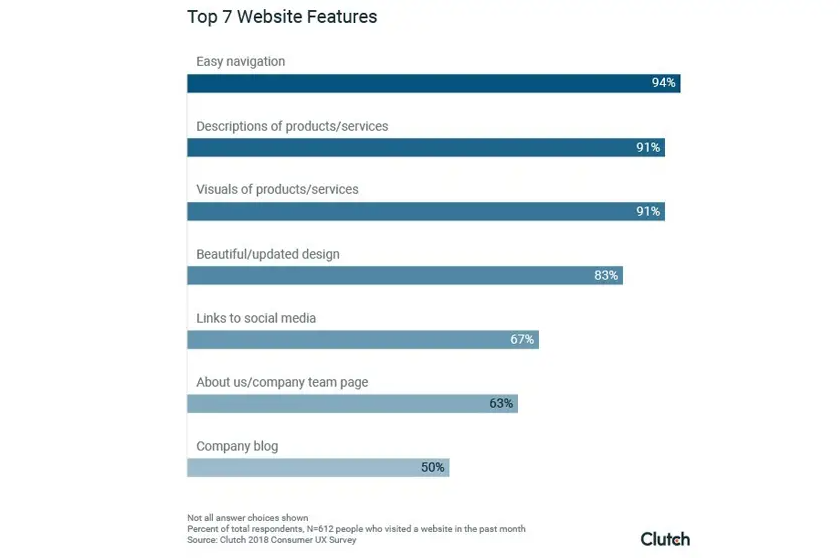
According to a study by Clutch, 94% of people say that easy navigation is the most important website feature.
Your startup can also get a boost in revenue from positive word of mouth and attract higher traffic from various platforms or organic searches. So when you are hiring design services for UI/UX, consider all the factors such as budget, goals and metrics carefully. This can help you create a brief or guidelines for an easy to navigate website which increases conversions or encourages visitors to return.
What Does A Good Startup Website Look Like?
One of the first things that people look for in web design for startups is functionality. For startups, it’s essential to provide a good user experience as first impressions really matter. Research says that it takes visitors only 50 milliseconds to form a perception about the website and more than 90 percent of the opinions are based on design.
This brings us to the question of what a startup website should look like to appeal to the target audience. Simply put, there are five main factors which you can keep in mind for a user-friendly design:
- Visual Hierarchy
- Minimalism
- Simplified Navigation
- Interactive features
- Easy to understand content
There are three types of basic websites such as static, dynamic and an ecommerce platform. With time, web design has become quite a profitable field and experienced designers can earn up to $100,000 per year, according to Glassdoor. In the examples below, you can see exactly what good web design for startups looks like and understand how each of these elements can hold the attention of the visitor.
The List of Platforms to Look for Intersting Website Designs
- Dribbble – a platform where designers showcase their work and you can browse through different design categories, including web design.
- Behance – similar to Dribbble, Behance is a platform for designers to showcase their work. You can find web design projects under the “Web Design” category.
- Awwwards – a website that recognizes and awards the best web design, UI design, and UX design projects. You can browse through their gallery for inspiration.
- Pinterest – a social media platform where you can search for web design inspiration and save them to your board for later reference.
- SiteInspire – a curated gallery of web design inspiration from around the world, sorted by different categories.
- CSS Design Awards – a platform that recognizes and awards the best CSS websites. You can browse through their gallery for inspiration and filter by different categories.
- The Best Designs – a website that showcases the best web design projects from around the world. You can browse through different categories for inspiration.
- Designspiration – a platform that allows you to search for design inspiration, including web design, and save them to your board.
- FWA – a platform that showcases the best digital projects, including web design, and awards them based on creativity, usability, and content.
- Land-book – a platform where you can find curated web design inspiration, sorted by different categories such as landing pages, portfolios, and e-commerce sites.
20 Best Web Design Examples for Startups
If you are looking for inspiration or ideas for web design for startups, then you can find some of great ones here. We have created a list of the best examples of websites of startups that have various features which can attract a wider audience successfully.
- Coda
The website has been developed by Coda Project and the cloud editor is created by Alex DeNuei and Shishir Mehrotra. Coda ranks highly on our list of web design for startups due to the following features:
Pros
- Interactive layout with a clear call-to-action that tells visitors what to do next.
- Soothing pale colors and bold, Sans Serif fonts for headlines.
- Large header image and ample white space for a minimalistic appearance.
Cons
- Blue and white call-to-action on the navigation bar might confuse some visitors.
Author: coda.io
Verdict: This is surely one of the best examples of web design for startups.
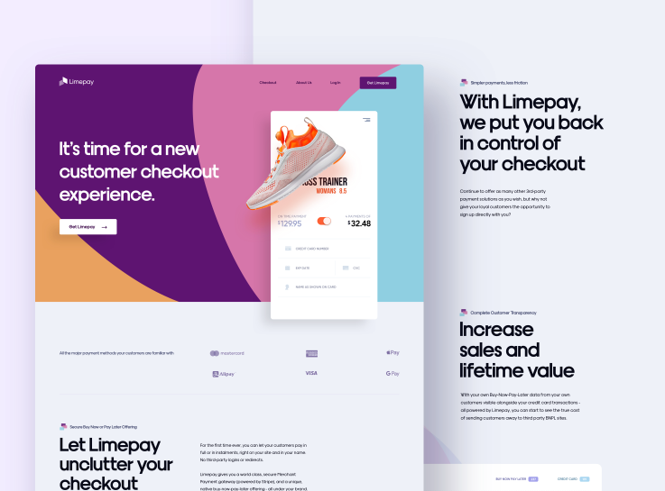
- Limepay
The website has been designed by Reform Collective in collaboration with the Limepay Service. It has been revamped since the launch with a different color scheme and layout.
Pros
- Striking hues of purple in contrast with white and black. This website has clear-cut, modern fonts for both the content and headings.
- It has a bold headline right below the navigation bar which tells people what the company has to offer.
- The webpage also features a video that highlights the technology behind Limepay.
Cons
- No call-to-action on the header for easy navigation.
Author: https://www.limepay.com.au/
Verdict: The website is clean, interactive and can engage visitors for more than a minute.
Link to Original Website:
- Kohost
This is designed by Jimmy Raheriarisoa for this hospitality startup.
Pros
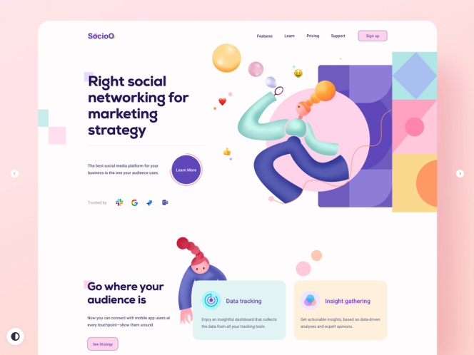
- With a bright call-to-action that stands out against the white background, Kohost manages to keep the attention from the beginning.
- The hues of pale pink and round shapes have a calming effect on the viewer.
- Minimal text with dynamic images that help visitors understand how it works.
Cons
- One page website with no drop-down navigation.
- Missing social proof.
Author: https://kohost.io/
Verdict: One-page web designs are good for service-based startups.
Link to website: https://dribbble.com
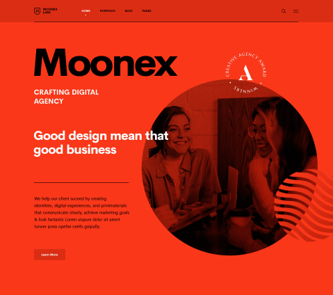
- Digital Marketing Agency
This is an appealing template for a digital marketing agency web design that has made our list. It is created with a website builder tool which is a quick and easy option to design your own web page.
Pros
- The simple design and large background image highlights the purpose or mission clearly.
- Clear navigation bar at the top with the blue and white brand colors.
- Sans Serif fonts for a modern and futuristic appearance.
Cons
- Missing live chat option to answer questions in real-time.
Author: logodesign.net
Verdict: You can consider a similar web design for startups in digital marketing.
Link to similar design:
- Exposure
The photo-sharing website is created by Luke Beard and Kyle Bragger.
Pros
- The web design focuses on a lot of imagery with less text that tell people about the startup.
- You can see that the call-to-action immediately catches the eye and encourages visitors to ‘sign up’ or ‘get started’.
- With its classic black and white color scheme and Serif fonts for headings, this website is one of the best examples in web design for startups.
Cons
- Large background image can be overwhelming for some people.
Author: https://exposure.co/
Verdict: Good for design agencies and creating online portfolios for clients.
6. Salesforce Desk
When it comes to web design style, Salesforce Desk has just got it right.
Pros
- The web design focuses on easy navigation and conveys all the important information without overwhelming the viewer.
- Its blue and white color contrast highlights the core brand values of security, professionalism and growth.
- Visitors can also access the live chat pop-up and ask any questions about the products or company.
Cons
- Smaller visuals which may be confusing to understand or fail to get their attention.
Author: https://www.salesforce.com/
Verdict: An engaging and professional web design for startups which can increase conversions.
7. Utrust
This website has made it to quite a few best design lists and put the brand on the map. It’s created and managed by Burocratik Digital Agency.
Pros
- The dynamic web page of this fintech startup is designed to interest visitors and convince them to take action.
- It features an animated process of the way that Utrust can help businesses or individuals make transactions with digital currencies.
- This startup has chosen a purple and white color combination to create a strong and lasting impact on the visitors.
- With its side and top menu bar, the website focuses on providing people an interactive experience.
Author: https://utrust.com/
Verdict: Highly interactive web design for startups offering solutions with new digital tools.
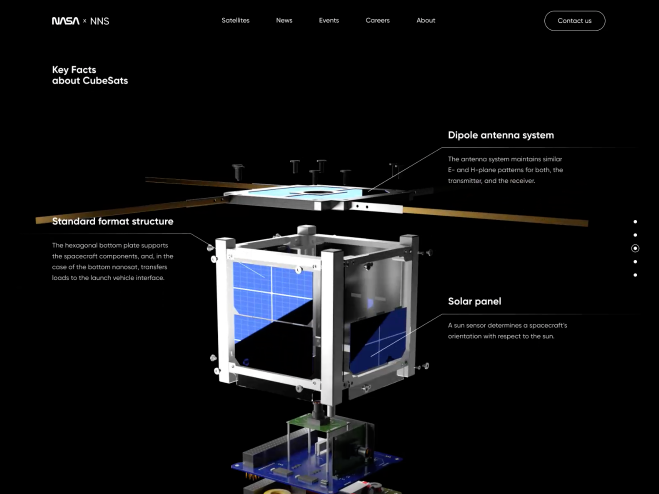
8. Brooklinen
This ecommerce platform offers a great user experience to consumers looking for home essentials.
Pros
- The web design draws attention with high quality visuals of the sheets, towels, comforters and pillow cases.
- With its elegant headline fonts which immediately get attention and soothing pastels, the website encourages people to scroll down and look for more information.
- One of the best features of this page is the hamburger menu which keeps the appearance minimalistic and simplifies the navigation.
Cons
- Text size for content is very small which makes it difficult to read.
Author: https://www.brooklinen.com/
Verdict: Easy to navigate web design for startups in ecommerce.
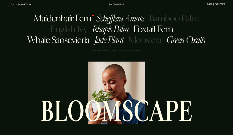
9. Primer
The website designed to give the target audience a clear idea of what Primer has to offer.
Pros
- The educational website features colorful visuals and all the relevant information without creating any clutter.
- This web page has a large visual and minimal text above the fold with an eye-catching call-to-action.
- The white background creates a striking contrast against the purple and allows people to focus on the imagery.
Cons
- Chunks of text without visuals which might not keep the visitors interested for a long time.
Author: https://primer.com/
Verdict: Good for development startups or software solutions.
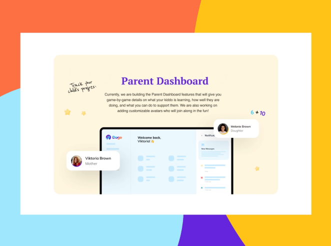
Link to similar design: https://dribbble.com/shots/15950276-Playdogo-Website-Interaction
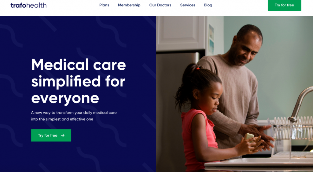
10. Capsule
It has made the list of the best startup web design examples for its creative and unique layout.
Pros
- With a calming green and yellow color palette, this website encourages visitors to stay on the page for a long time and return as well.
- The geometric shapes and visuals make it easier for the target audience to trust the company and avail their services.
- Clear-cut fonts for the headlines and content, including FAQs which are on the home page.
Cons
- No drop-down menu for simple navigation.
Author: https://www.capsule.com/
Verdict: Appealing colors and shapes make it a good web design for startups.
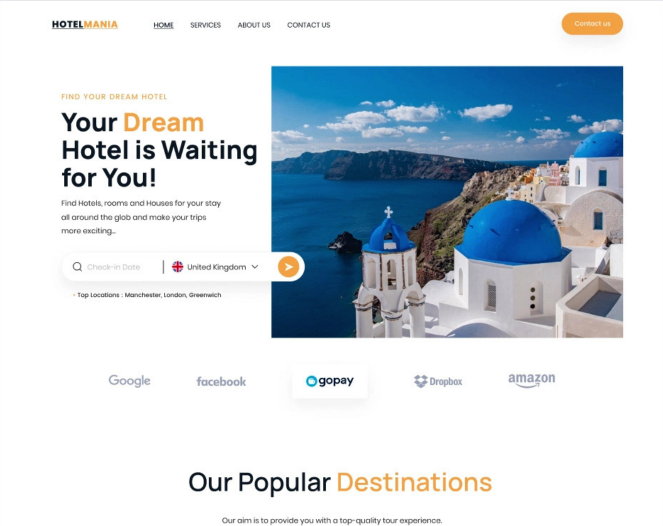
11. Picto
The ecommerce website has been created in collaboration with Sunland for the watch company.
Pros
- This website makes it easier for people to get a closer look at their products by using bold colors and large images in their web design.
- As you scroll down, you can find all the information about the watch bands, colors and materials that the startup has to offer.
- The large header image has a prominent call-to-action for different categories.
Cons
- Less white space above the fold which could appear the elements appear cluttered.
Author: https://pictowatches.com/
Verdict: Good web design for startups looking to target a young audience.
12. Squarespace
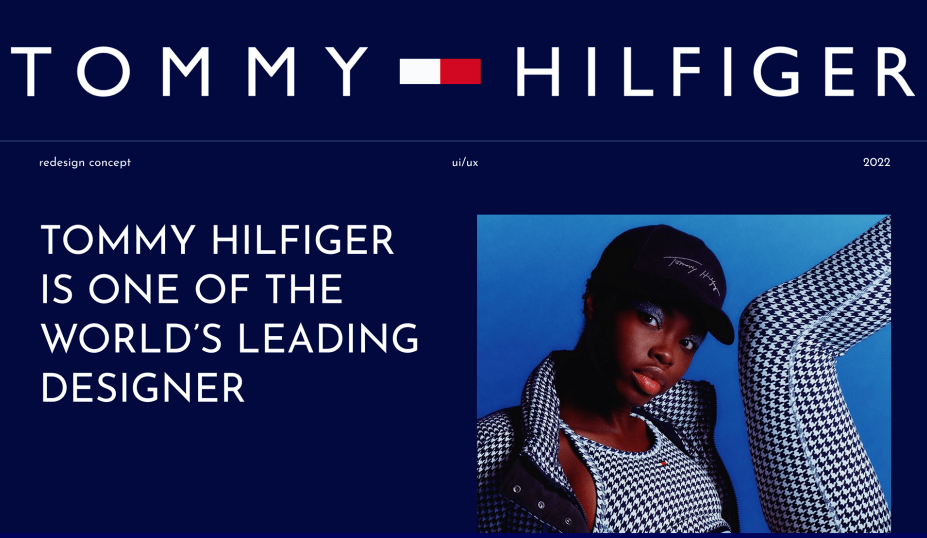
The web design from Squarespace has a lot of elements but it does not overwhelm the viewer.
Pros
- With an animated header that shows the product, the website has all the relevant details on the home page.
- The classic black and white color scheme boosts brand recognition and increases conversion rate.
Cons
- Can be confusing for some people to find the relevant information.
Author: https://www.squarespace.com/
Verdict: Great for startups in web design and development.
13. Puffin Packaging
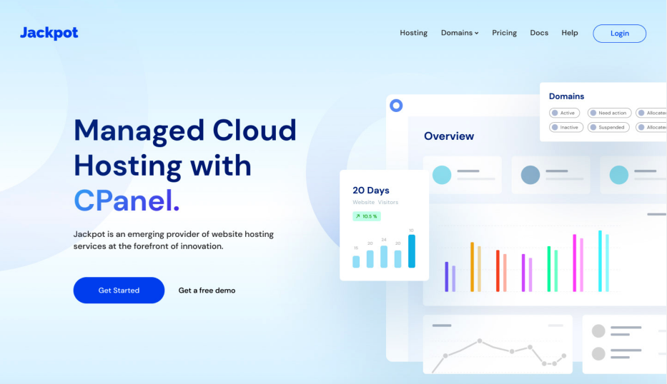
The startup offers eco-friendly packaging to businesses and consumers.
Pros
- With a minimalist layout, this website draws attention to the visuals and important information.
- The calming hues of green tell people about the packaging business and create a positive perception in their minds as well.
- This company has also utilized white space effectively for a minimalist appearance.
- Visitors can also find social proof towards the end of the page and get a closer look at the packaging.
Cons
- Navigation bar at the top is smaller for desktops and large screens.
Author: https://www.puffinpackaging.co.uk/
Verdict: Good for ecommerce startups.
14. Better
Pros
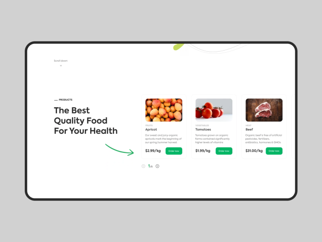
- This startup website is looking to attract people that are interested in homeownership.
- The appealing header image has a clear call-to-action that encourages visitors to find out the current rates for buying or refinancing.
- With a white background, green accents and bold, black text, this web page has a clear-cut design that keeps visitors on the page for more than a few seconds.
Cons
- Less information above the fold for first time visitors.
Author: https://better.com/
Verdict: Good for startups in real estate and investment.
15. Milk Jar
Pros
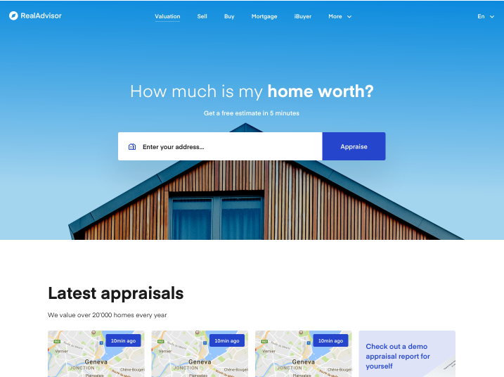
- The wide header is used to tell people about the products which are back in stock or currently available.
- The call-to-action for ‘shop’ is subtle and does not take the attention away from the visual.
- You can also find social media accounts at the top and follow the Facebook page or Instagram account.
- This website has a clean layout with high quality product photos.
Cons
- Color contrast can be overwhelming for some people.
Author: https://www.milkjar.ca/
Verdict: Good web design for startups that can engage a wider audience.
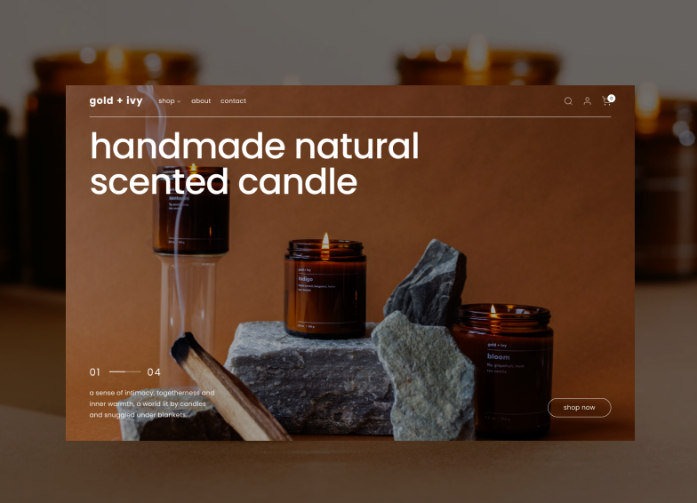
16. Nuro
When it comes to web design style for startups, Nuro has just got it right.
Pros
- The first thing that visitors see is a headline in clear, sans serif fonts which tells them what the startup has to offer.
- An animation that shows how the vehicles work appears on the page as you scroll down.
- The website has minimal text and attractive visuals which showcase the technology and the way it can help people with delivery.
Cons
- Has less information for people who may be unaware of the company.
Author: https://www.nuro.ai/
Verdict: Good for tech startups.
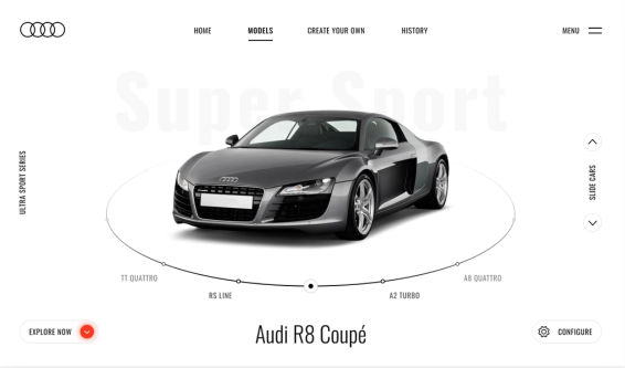
17. Store Maven
Pros
- With a bold and futuristic visual that covers the area above the fold, this startup managed to convey the relevant information from the beginning.
- An animation on the side highlights the traffic and conversions for apps. T
- The web design reminds you that the company specializes in data and analytics with its modern layout and dynamic images.
Cons
- Could be overwhelming for some people.
Author: https://www.storemaven.com/
Verdict: Great for startups creating app designs or offering digital tools.
Link to original design: https://dribbble.com/shots/12582716-Storemaven-s-website
18. Apothekary
Pros
- This web design for a startup focuses on appealing, animated images and text that tell the visitor what the brand has to offer.
- Soothing color scheme and black and white contrast for the call-to-action which are creatively encourage people to buy the products.
- There is a navigation bar at the top that also has a quiz that visitors can take to find suitable blends.
Cons
- The color contrast could confuse people in the beginning.
Author: https://apothekary.co/
Verdict: Good for ecommerce platforms.
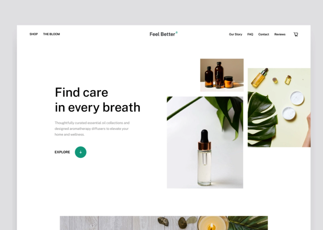
19. Drip
This startup provides solutions for email and SMS marketing.
Pros
- It has a colorful website with ample white space that allows visitors to focus on the visuals and information.
- With a bright call-to-action and modern fonts, the page is designed to convey the right message to the visitors.
Cons
- Fewer visuals to keep first time visitors interested on the page.
Author: https://www.drip.com/
Verdict: Attractive web design for startups in marketing and branding.
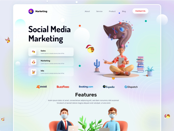
20. Vessi
Pros
- The clear and high-quality product image is the first thing that people notice on the page.
- There is navigation bar above the header which makes it easier for people to find what they are looking for.
- This web design keeps the attention on the visuals with minimal text that conveys relevant information without going into a lot of details.
Cons
- More product images on the home page to attract visitors.
Author: https://vessi.com/
Verdict: Good web design for startups in e-commerce.
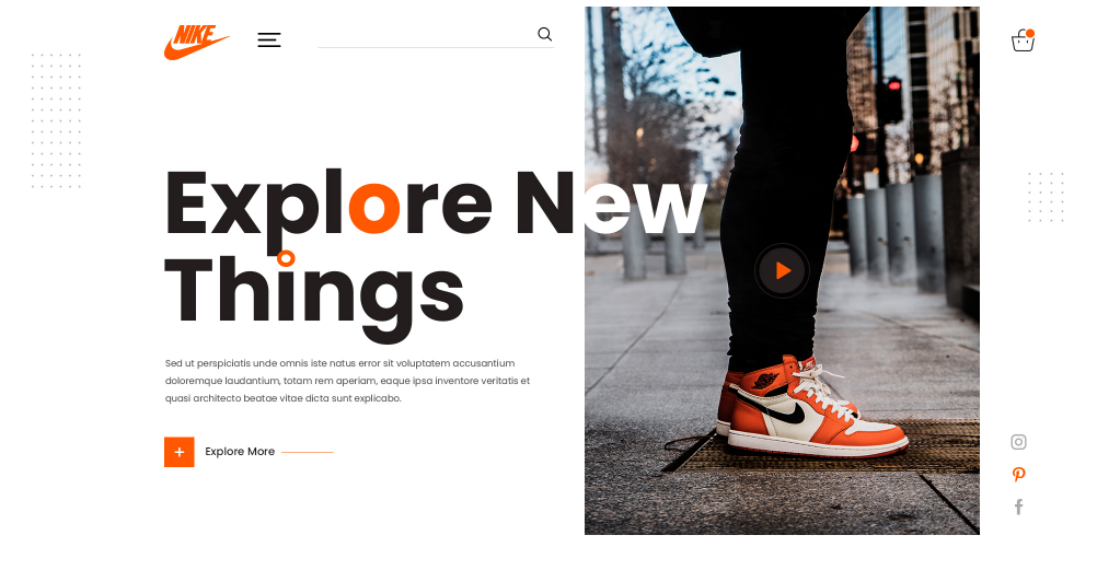
Before designing a website, it is important to establish achievable goals and consider practices which can help you get the desired results. With a well-designed website and a strong presence on social media platforms, you can attract a wider audience in a short time. If you are looking to start a business or startup with no money, a good and relevant web design for startups can help establish credibility in the early days.
You can easily reach out to your customer base and build trust with social proof, interactive and minimalistic design and a video or clear images. You can opt for a third-party website builder, professional designer or WordPress. It can cost you less between $100-500 if you go for a DIY tool or basic WordPress theme and above $1000 for a skilled designer. For a startup website, it is a good idea to go with a reasonable option that does not charge a lot of money.
Do You Want a Design That Will Be Featured By Leading Agencies?
We are fully confident you are! We will be glad to help you.
According to techreviewer, designrush, clutch, SumatoSoft is one of the top software development companies. But we are recognized as a top developer not only because of highly skilled software developers but also because of talented and creative designers! There is an aphorism “The shoemaker’s children go barefoot”, and you have probably seen that while browsing design companies’ websites that don’t look stylish at all and provide a poor user experience. Well, this aphorism has nothing to do with the SumatoSoft website! The design of our website was featured by csslight, a platform that promotes new talents and trends in the world of designing. We are ready to create a design for your startup that will blow people’s minds. Contact us and get a quote totally for free!
Have You Found The Inspiration?
The designs here are for different websites that target businesses or consumers directly. Hopefully, they can inspire you to create one for your startup or give a few useful ideas so you know what to focus on! You may also find inspiration in portfolios of companies who won some web design awards. It is important to keep in mind that a website should be relevant to the type of business or service and reflect the brand values as well.
Let’s start
If you have any questions, email us info@sumatosoft.com

